Get the Best of Data Leadership
Stay Informed
Get Data Insights Delivered
What is accessibility?
Accessibility, applied to software, is what we call the design features that allow it to be used by everyone, regardless of their abilities. Software should work whether you use a keyboard, a mouse, or voice control. It should work if you struggle to read small text, or allow you to continue working after that time you broke your arm playing soccer.
While some disabilities such as blindness are long-term, injuries from work or sports might be temporary. Some disabilities are visible by the tools that those people require, but some disabilities are invisible: we are not always likely to know by looking or working with someone if they are affected with colorblindness, low vision, or difficulty hearing.
Why accesibility matters to me
For me, accessibility is also personal. I have the privilege of parenting three amazing children who have their own unique challenges using computers. One of my children struggles to deal with complex interfaces and will miss important details if they are not obvious. Another child in my home needs large text, high contrast, and prefers a touch screen. He’s often looking so closely at his screen that he cannot see the notifications in the corner.
In my day to day at Bigeye, I work with an extremely varied customer base of software users who are both disabled and non-disabled. I like to believe that I'm contributing to a world that recognizes each person's humanity and dignity in whatever they want to do. Specifically, anyone's disability status should not impact their ability to contribute to data engineering or technology. We build for teams that are diverse, and expect their tools to accommodate every team member. Accessibility for Bigeye isn't a nice-to-have. It's a baseline for usable software.
In the software world, accessibility often gets treated like a compliance hurdle rather than a design principle.
At Bigeye, we've taken a different approach. When you bake accessibility into your product thinking from day one, something interesting happens: you don't just make software usable for people with disabilities. You make it genuinely better for everyone.
Why accessibility makes business sense
Even if you're approaching this purely from a business perspective, accessibility creates tangible value:
Inaccessible design is an operational liability. When your data team can't use an observability tool effectively because of poor contrast or confusing navigation, incidents take longer to resolve. When alerts are visually dense and hard to parse under pressure, people miss critical information.
Accessible design improves usability for everyone. According to the CDC, 1 in 4 adults in the US has some type of disability.The improvements we make for accessibility consistently benefit users who don't consider themselves to have a disability. High contrast text is easier to read in bright conference rooms. Logical keyboard navigation helps power users move faster. Clear error messages reduce support tickets. Simple, consistent layouts reduce cognitive load. Having accessible HTML markup even improves SEO.
Unique challenges in data engineering
Data engineering and observability present relatively unique accessibility challenges that many traditional web accessibility guidelines don't address directly.
Information density is our default. We're accustomed to database tools that display tables with dozens of columns and hundreds of rows. Dashboards pack multiple charts, metrics, and alerts into a single view. This visual density that feels efficient to some users can be completely overwhelming to others, particularly users with ADHD, or processing disorders. When you're trying to identify the root cause of a production incident, cognitive overload isn't just an accessibility issue; it's an operational risk.
We rely heavily on visual encoding. Data teams love charts, heatmaps, and color-coded alerts because they can surface patterns quickly. Red means bad, green means good, and the slope of a line tells you everything you need to know at a glance. But these visual shortcuts create barriers for users who can't perceive color differences. We've had to rethink how we make these insights accessible without losing their power.
Context is everything, and it's often missing. A table showing "95.2%, 94.8%, 96.1%" is meaningless without knowing what metric you're looking at, what time period it covers, and what the expected range should be. Screen reader users navigate through data linearly, but sighted users can glean context from visual hierarchy, nearby labels, and layout. Making data tables truly accessible means embedding that context directly into the data presentation.
Speed matters differently. In many web applications, accessibility might mean slowing down interactions to ensure they're perceivable and understandable. But in observability tools, speed often directly correlates with business impact. We've had to find ways to make interactions accessible without sacrificing the rapid navigation patterns that data teams depend on during incidents.
Progressive disclosure becomes critical. The answer to overwhelming interfaces isn't always to show less information, sometimes you need all of it. But we've learned to structure information hierarchically, allowing users to dive deeper into details without losing their place in the broader context. This benefits everyone, but it's essential for users of assistive technologies.
How we design for accessibility at Bigeye
Accessibility is integrated into multiple stages of our development process, not bolted on at the end. Here's how we approach it:
During design
Before any code gets written, we're asking accessibility questions:
Color and contrast: Are we using colors that work for users with different types of color vision? We test our palettes against deuteranopia, protanopia, and tritanopia simulations. Do our colors meet WCAG contrast requirements? We aim for AAA contrast ratios where possible, not just AA, because data work often happens in suboptimal lighting conditions. Is our text legible at different sizes? This doesn't just help users with vision differences, it ensures dashboards remain readable when projected in conference rooms or viewed on varying screen sizes.

Navigation and layout: Is there a clear, logical navigation flow? We design keyboard navigation paths before we design mouse interactions, ensuring users can move through interfaces in a way that makes sense. Are headers and sections properly structured? We use a clear heading hierarchy that works both visually and for screen readers. Do we avoid keyboard traps where users get stuck in a particular interface element? This is especially important in our modal dialogs and complex data tables.
Interactive elements: Do buttons, links, and form controls look interactive? We follow our design system religiously because consistent visual language helps users predict how elements will behave. Are clickable areas large enough? We ensure touch targets meet minimum size requirements, which helps users with motor impairments and anyone using touch interfaces.
Error handling: How and when do users learn about errors? We've moved away from real-time validation that can interrupt screen readers and cause cognitive overload. Instead, we validate on form submission and provide clear, actionable error messages that explain both what went wrong and how to fix it.
During development
The coding phase introduces its own set of accessibility considerations:
Semantic markup: We use proper HTML elements for their intended purposes, buttons for actions, links for navigation, headings for structure. This seems basic, but it's foundational for screen readers and other assistive technologies. When we need custom components, we add appropriate ARIA labels and roles.
Dynamic content: Data tools are inherently dynamic: metrics update, alerts appear, tables refresh. We ensure users know when content changes by using ARIA live regions to announce updates. This helps screen reader users, but it also provides valuable feedback for anyone who might miss visual changes while focused elsewhere.
Alternative formats: Every graph has an accessible data table equivalent. Every icon has descriptive text. Every meaningful image has appropriate alt text.
Focus management: When users navigate with keyboards, where does focus go? When modals open, we trap focus inside them. When they close, we return focus to the triggering element. When page content changes, we move focus to the new content if appropriate. This creates a predictable, usable experience for keyboard users.
Testing and validation
We test accessibility throughout development, not just at the end:
Automated checking: Our linting tools catch missing alt text, insufficient contrast, and improper ARIA usage before code gets committed. These tools can't catch everything, but they prevent common mistakes from making it into production.
Manual keyboard testing: One of our first manual tests for any new feature is navigating it entirely with a keyboard. If you can't use a feature efficiently with just the Tab, Enter, and arrow keys, it's not ready to ship.
Screen reader testing: We test with actual screen readers (primarily NVDA and VoiceOver) to ensure our interfaces make sense when experienced non-visually. This often reveals assumptions we've made about how users will interact with our tools.
Cognitive load assessment: We evaluate whether interfaces are overwhelming or confusing, especially under stress. Data work often happens during incidents when cognitive resources are already strained.
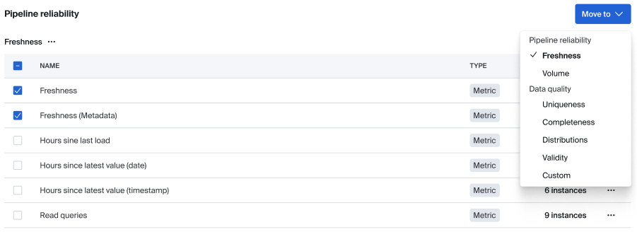
A real example: Data dimensions redesign
Let me walk you through a concrete example of how accessibility thinking shaped a recent feature. We're currently working on a project called Data dimensions, which allows Bigeye administrators to organize our various metric types into logical groupings for better reporting and navigation.
The initial approach: Drag and drop
Our first design had what we thought would be an intuitive drag-and-drop interface. Each dimension would be displayed as a card containing its assigned metric types, and administrators could drag metrics between dimensions:
Dimension: Data Quality
├─ Null Rate
├─ Duplicate Count
├─ Schema Drift
└─ [drag handles]
This is how it originally appeared within the Bigeye platform:

This felt modern and interactive, but accessibility testing revealed immediate problems:
Keyboard navigation was nearly impossible. While some drag-and-drop libraries support keyboard operation through complex key combinations, moving a metric from one dimension to another required memorizing non-standard shortcuts. For users who rely on keyboard navigation, this feature was effectively unusable.
Screen reader support was poor. The drag-and-drop interaction provided little feedback about what was happening or where items could be moved. The visual affordances that made the interface intuitive for sighted users—seeing the available drop zones, understanding the spatial relationships—were completely lost.
Cognitive load was high. Even for users comfortable with drag-and-drop, the interface required holding multiple pieces of information in working memory: which item you were moving, where it came from, where it could go, and what the consequences of the move would be.
The second iteration: Inline dropdowns
We tried to solve the keyboard and screen reader issues by replacing drag-and-drop with dropdown menus directly on each metric:
Dimension: Data Quality
├─ Null Rate [Dropdown: Data Quality ▼]
├─ Duplicate Count [Dropdown: Performance ▼]
├─ Schema Drift [Dropdown: Data Quality ▼]
This fixed the keyboard navigation and screen reader problems, but created new issues.

Immediate changes were disorienting. When users changed a dropdown selection, the metric would immediately move to its new dimension. For screen reader users, this meant their current location in the interface would suddenly change without warning. Their next tab or arrow key press would land somewhere completely unexpected.
Visual continuity was broken. Even sighted users found it confusing when metrics disappeared from view immediately after reassignment, especially if the new dimension was further down the page.
Error recovery was difficult. If users made a mistake, they had to hunt through the interface to find their misplaced metric and correct the assignment.
The solution: Edit-in-place with confirmation
Our final approach kept the dropdown interface but added a crucial element: changes weren't applied immediately. Instead, users could make all their desired changes and then confirm them with a save button:
Dimension: Data Quality
├─ Null Rate [Dropdown: Data Quality ▼] *modified*
├─ Duplicate Count [Dropdown: Performance ▼] *modified*
├─ Schema Drift [Dropdown: Data Quality ▼]
[Save Changes] [Cancel]
This approach solved multiple problems simultaneously:
Predictable navigation: Users could make changes without losing their place in the interface. Screen reader users could review their changes before applying them.
Clear feedback: Modified items were visually marked, and users could see all their pending changes before confirmation.
Error prevention: Users could review their changes and catch mistakes before applying them.
Batch operations: Users could reorganize multiple metrics in one operation, reducing cognitive load and the number of required interactions.
Better performance: Instead of multiple individual API calls, we could batch all changes into a single update.
The accessibility-driven design turned out to be superior for all users, not just those using assistive technologies. It was more efficient, less error-prone, and easier to understand.
Current accessibility features in Bigeye
I want to highlight some accessibility features we have in production today that demonstrate how accessibility thinking improves the experience for everyone:
Dual-format data presentation
When you look at a Bigeye issue or metric, we show you a chart that visualizes recent data points over time. But we also provide the same information in a structured data table below the chart. This isn't just for screen reader users—many of our customers prefer the tabular format because it's easier to identify exact values and timestamps. The table doesn't just show raw numbers; it includes contextual information about what you're looking at and what the values mean.
For example, instead of just showing:
95.2, 94.8, 96.1, 93.7
We show:
Completeness Rate for orders.customer_id
April 1: 95.2% (Expected: >95%, Status: Normal)
April 2: 94.8% (Expected: >95%, Status: Below threshold)
April 3: 96.1% (Expected: >95%, Status: Normal)
April 4: 93.7% (Expected: >95%, Status: Alert triggered)
Accessible modals and focus management
When you interact with modals in Bigeye—whether you're configuring an alert, editing a metric, or reviewing an incident—we trap focus within the modal for both screen readers and keyboard users. This prevents confusing scenarios where you might accidentally tab out of the modal and lose your place.
We use proper form semantics with explicit labels, fieldsets for grouped controls, and clear error messaging. Rather than showing validation errors as you type (which can interrupt screen readers and be cognitively overwhelming), we validate when you submit and present all errors at once with clear explanations of how to fix them.
High contrast and dark mode
We offer a dark mode that many team members use during late-night incident response, but it's designed with accessibility in mind. We maintain proper contrast ratios in both light and dark themes and avoid relying solely on color to convey information. Our alert colors, for instance, are differentiated by both color and iconography.
Keyboard navigation throughout
Every interactive element in Bigeye can be reached and used with just a keyboard. We've designed logical tab orders for complex interfaces like our metric configuration screens and dashboard builders. Focus indicators are clearly visible, and we provide keyboard shortcuts for common actions.
Reduced motion options
For users who prefer reduced motion (whether due to vestibular disorders or personal preference), we minimize unnecessary animations and transitions while maintaining the visual feedback necessary for understanding interface changes.
Accessibility as craft and commitment
Building accessible software isn't a one-time effort, it's an ongoing practice that requires constant attention and iteration. We're always discovering new ways our interfaces could be clearer, faster, or more inclusive.
Some areas where we're actively improving:
Better error recovery: We're working on more graceful error handling that provides clear next steps without overwhelming users with technical details.
Smarter defaults: We're analyzing how different users interact with our tools to provide better default configurations and more intuitive workflows.
Progressive enhancement: We're exploring ways to layer complexity, allowing users to start with simpler views and add detail as needed.
Performance optimization: Faster loading times and more responsive interactions benefit everyone, but they're especially important for users of assistive technologies.
Better documentation: We're improving our help documentation to be more scannable, actionable, and accessible itself.
The work never feels finished, and that's as it should be. Every user we talk to, every usability test we run, and every accessibility audit we conduct reveals new opportunities to improve.
Accessibility isn't just about compliance or doing the right thing (though it is both of those things). It's about designing software that works well for humans—all humans—in the messy, stressful, high-stakes environments where data work actually happens.
Bigeye is building for the future of enterprise AI and data. And that future has to include everyone.
Monitoring
Schema change detection
Lineage monitoring

Tyler Jones


.png)